Archive for the 'blog design' Category

Kitty In Box..

Last week Matt Cutts posted about the Kitt Inbox, which is a very plush looking inbox for cats that you can attach to your desk. I sent the link to The Other Half, who thought it was a great idea. This week he discovered a version that cost us.. well.. nothing.. because it is the lid of a 5 ream box of paper. ;) Except it does take up a little desk space.

Little Kitty In A Box

I don’t know why cats have an obsession with boxes - or even if all cats do, but ours certainly can’t resist a box. They have all manner of comfortable places to sleep yet they will choose a box over any of the comfortable places anytime, even if they don’t quite fit inside it.

And yes, I will post something non-kitty related soon - things are a tad hectic at the moment. I’ve done a couple of new websites for people this week - Artists Blog for Artoholic from the Aussie Bloggers Forum - Cindy made her own header and it is gorgeous. I like the theme with the white on the sides, too.

Kin’s Money for Kin who I knew previous to the Aussie Bloggers Forum and who recently became a moderator there. Kin had found the little piggy which inspired the text in the header - I am crazy about it. Whenever I create a new header for someone it is like a very intoxicating drug - I can’t get enough of looking at it for a little while. I love the texture of the gold text. I tried to make the gold a little darker but then it didn’t quite match the pig and it never looked quite as good as that shade of gold you see there now.

While working on Kin’s Money, I discovered just how lucky I was to find this Freedom Green theme right off the bat because I went looking for a different theme to use. We found one and we tried using it only to find halfway through that the middle sidebar was not widgetized. The same thing had happened to me with a theme that Artoholic Cindy wanted to use only that one was completely non-widgetized.

I’ve done countless websites with the Freedom Green theme now - below you will see links to a few of them - and it never gets old for me - but I think it always looks slightly different and new because I always customise it and change the colors. In this case I changed the text for Kin and I like the different text so I may experiment with a few different fonts here on my blog.

Gemisht (purple nav bar)

LighteningOnline (a gorgeously raspberry color)

The Nutcracker Ski Club (I reversed the nav bar on this one)

Miss Amelia Smith (orange nav bar)

Kin’s Home Of Slightly Cracked Dreams (lovely and orange all over!)

Birdwing Therapies (love the green and gold)

Cherry Blossom Adventures (pink! And then some! I love the pink fade along the white edges)

Aussie Bloggers Blog (I still adore the header I made for this, it never gets old)

I don’t think I missed anyone out who is using this theme but let me know if I did. ;) As you can see by looking at the sites above, the Freedom Green theme is highly customisable. And I know this theme like the back of my hand now - I will always recommend using it to people simply because I know it well enough to be able to trouble shoot. ;)

Introducing The Green Collection

Some of you may remember a while ago I released a collection of metallic RSS Feed Icons. I have now released the Green Collection.

The Green Collection - click on the image for a larger view.

Green RSS Feed Icons

Download the .zip file - RSS Feed Icons

Neerav Bhatt - Rambling Thoughts On A Road Less Travelled.

From time to time I find a new Australian blog which makes me get all tingly in my outer limbs with excellent writing, great design, amazing photography or just plain old fashioned humor. I think we Australians don’t give a lot of credit to ourselves as writers, photographers or bloggers in general. Many of us respect *other* Australian bloggers but we try to diminish ourselves as bloggers. It’s a uniquely Australian trait to say “Look what (insert someone else here) did” while completely overlooking what we ourselves did.

I have been to the majority of the top 100 Aussie blogs. I’d say 99% of the top Aussie bloggers are community orientated people, willing to support others in their efforts. That is one thing I love about the Australian Blogs Community.

Today I want to tell you about two new blogs I found after Neerav Bhatt sent me an email asking if I could give a heads up to voters in Australia - they needed to register to vote fast if they weren’t registered already due to changes in the law. I know I was not the only Australian blogger to receive that email. That in itself is utterly unique. Going out of ones way to help others is something I love to see and I wish there was more of it in the world today.

Another thing I love to see is a good About Me page - and Neerav does not disappoint. Bloggers, I have seen a lot of about me pages. Some of them are ok. Some of them short, uninformative and I leave the page feeling none the wiser about the blogger - it’s called an ABOUT me page! Go have a look at this one - Everything you ever wanted to know about Neerav Bhatt - and then take a look at your own, and think about it carefully.

Looking at this about me page I can think of a few things I need to add to mine. I’m even thinking about *gulp* adding a pic. It would be an older one for security reasons but I think ya’all would be ok with it. It is wonderful to know so much about someone before even *reading* their blog so well done Neerav on the about me page!

Checking out your books I see we both love James Herriot. ;) And two of your favourite movies are also.. my favourite movies. The Shawshank Redemption and Office Space. Something else we have in common is photography (see Neerav’s picasa albums here ) and some of your photos are simply stunning! You have gone one step further than me and created some free computer desktop wallpaper . Take a look at this photo -

Rainbow Bee Eater Snapping Up Insects

You should click on the thumbnail or else you may not see what is special about this image. Being a photographer myself I know that a shot like this is a matter of being in the right place at the right time as well as about a hundred other factors which can easily ruin a good shot quicker than you can blink. ;)

Neerav has two blogs and I knew I had seen The Road Less Travelled (59th on the Top 100 Aussie Blogs List) before because of that stunning header graphic. The Rambling Thoughts Blog (47th on the Top 100 Aussie Blogs List) was new to me but every article on the front page was well written, enjoyable and extremely informative.

I love it when I visit a blog and find a piece of information I didn’t know I wanted but once I have it I get all excited about it. There was several such pieces of information on both blogs. There’s a great post about Australian Political blogs, some of which I have bookmarked for later exploration. I’m so out of the loop when it comes to commercial television, I had no idea Shaun Micallef has a new show. I have recently spotted a few good episodes of The Sideshow with Paul Mcdermott, I’d be interested to see a blog post with your thoughts on that.

Let’s talk color schemes and themes for a moment. Neerav has used my two favourite colors, green on The Road Less Travelled which has two sidebars and blue on Rambling Thoughts Blog which has one sidebar. Both look very professional but The Road Less Travelled is extra crispy and fresh thanks to the green. I’ve said many times that green is my favourite color to use on a website. More and more sites are starting to use it. I think Rambling Thoughts could use a tricked out header graphic like The Road Less Travelled has - just to make it stand out as a blog. ;)

The policy of writing one to two quality posts each week rather than being just another blog in the blogosphere echo chamber commenting on the same things everyone else is writing about is an excellent idea. You write beautiful and informative articles - the travel ones on the road less travelled are especially excellent - I did not know the Sydney public transport planner existed and I’ll be using that myself. Your info about getting around Adelaide is also great - having lived there all my life. And one of the things I miss most is the Museum there - free and fantastic.

The only thing missing on both the blogs is an I Reply policy. I think Neerav could delight his commentors if he replied to their comments regularly - I have seen that he replies from time to time. I try to reply to the comments on every post I write. I don’t always get there - and sometimes it takes me a few days to get back to them as I want to let people have time to comment - but committing to doing it has worked for me here on this blog. You’re not posting daily so this will be a lot easier for you to do than it is for me to do. ;)

People love it when you reply to them and you have the notify me tick box - a lot of people (me included) will tick that and come back to comment a second or even third time on a post. I spotted a post where you did reply - Photos from Outback South Australia, The Red Centre and Tropical Top End - and I love how your comment shows up in a dark green box.

How do you make an RSS feed for photos, though? A how to post on that would be wonderful - maybe you could do one as a part of our Tuesday Think Tank sometime? We’ll make the topic photography. ;)

Spam, Spiders And Do Follow, Oh My!

Today on Think Tank Tuesday I’m taking a look at No Follow and Do Follow and how these relate to blogs and spam, and Sephy is going to let you know how to turn no follow off on Blogger, Wordpress, and various other kinds of blogs. It is a lot easier than you think, you’ll be glad to know!

So what is NoFollow All About?

Most blogs come with no follow installed on the comments section automatically. This was originally done to prevent link spammers gaining anything from their spammy efforts. Unfortunately nofollow does not work - nofollow blogs still get spam comments.

That means anytime someone comments on your blog their link is not followed by the search engines. The commentor does not receive a link back on either Technorati or Google or Yahoo or any of the other search engines.

Is It Fair To Your Commentors?

By making a link no follow, you’re effectively saying to the search engines - I don’t trust this link. Given that most of us do actually trust the links of our commentors, this is not a Good Thing.

Choose Not To Give Link Juice -

When you have a blog, you can choose to make certain things no follow. For example, if I wanted to link to someone in a post but I did not want the search engines to see that link, I would put in a bit of code that turns the link into a no follow link. Why would I want to do that?

Link Bait -

Sometimes bloggers post controversial things in order to get links back to their blog. I can name a few who do this regularly. If you feel a blogger is link baiting but you still want to discuss their post there is an easy way you can make the link no follow.

Sephy has shown you how you can do this in his post on this topic - Say No To NoFollow, it is simple and easy to do.

You will still be giving their blog traffic if anyone clicks on the link, but it is better to do that than leave your readers wondering what the heck you’re talking about - and much better than giving the blogger what they are looking for by being controversial, which is backlinks to their blog. Don’t reward them by giving them link juice.

Links Mean $$$ To Some -

Why do bloggers link bait? To some bloggers, backlinks can mean money. The more back links your blog has, the higher ranking you get on Technorati, the higher your page rank, the higher price you can charge advertisers.

What Is Do Follow?

The Do Follow movement is basically people who have decided they want their commentors links to be followed by the search engines. These Do Follow bloggers have taken the time to remove no follow from their comments sections. Depending on what kind of blog they have this can be an easy task or a difficult one.

Sephy has explained how to make your blog do follow with instructions for Blogger, Wordpress, Typepad, Movable Type and some others.in his companion post to this one, make sure to read it. Here is the link again if you have not already opened it in a new window or tab - Say No To NoFollow

Will This Increase Spam?

In a word, no. I was getting spammed before I became do follow, and I have been spammed since. What will add to your chances of being spammed more often is by joining one of the Do Follow link lists that exist on the internet. These are targeted often by spammers looking for a way to build backlinks fast.

The Bumpzee Community -

There is a No Nofollow | I Follow | DoFollow Community at Bumpzee. Being a member of this community is worthwhile if you are a do follow blog because your posts go out on the RSS feed for other do follow readers to view. It has meant more traffic to my blog.

I believe three times since I joined the community, which was some months ago now, I have been spammed by people who came directly here from the Bumpzee community. These are the paid commentors. Their comments are easy to spot and easily deleted. So as far as I am concerned the issue of being spammed by people who know you are do follow is not much of a problem for me.

What If I Get Spammed?

You can easily turn no follow back on - but that won’t stop the spam. Spam is a problem we all have to deal with here on the internet. We just have to be adults about it, set a comments policy for ourselves, and then follow it.

Since I put in a comments policy on the page where people leave a comment, I have only been spammed once. The paid comments people seem to have got the message - it is a waste of their time to comment here and they won’t get paid for the comment because I delete it quickly. If you can do the same thing, you can keep your blog spam free.

How Can I Tell When It’s Spam?

The number one give away is the link they are using. When I see a comment that is possibly spam, the first thing I do is copy the link and take the link over to Technorati. For example, this is one of the comment spammers that has been here recently - on Technorati and another one - and as soon as you search for the URL you can see they have a lot of recent reactions with different names - Tom Paine, Lais Edwards, Richard Andrews, Clebsch Gordon, etc.

Why It Works -

Looking at the backlinks, some of the bloggers I most respect got caught out by these spammers. There’s a lot of familiar names and blogs there. I didn’t have the time to email or comment on all the posts, otherwise I would have.

The two blogs mentioned above now have medium level authorities on Technorati - (one has an authority of 51) (two has an authority of 65). You’ll note I am not linking to the blogs themselves, only to Technorati. I do not want to give them any link juice.

Team Up With Fellow Bloggers -

The major mistake these spammers made was - they visited Sephy’s blog not long after visiting mine, and left similar comments. Sephy and I discussed them on Skype and figured out it was spam, and then deleted them.

Don’t be afraid to contact a fellow blogger who has received a comment you suspect is spam and ask what their thoughts are on it. Sephy posted about it here - Paid Comments Not Allowed

Search The Name or URL-

Lucia spotted what was going on and wrote a post about it here - Jimmy Spam (& SEO Tip)! and many bloggers have been finding out it was spam via the search engines because of this post.

Post About It Yourself -

If spam has become an issue on your blog, it could be worthwhile posting about it so that other bloggers can be aware of it. When they google the names you keep seeing as spam, they will find your post and then they can delete the spam as well - and if they read your post, when those names turn up on their blog they can hit delete fast.

Just make sure not to give any link juice to the spammers - you can make individual links no follow easily (See Sephy’s Post for info on how) so please do so when referring to the links spammers leave, or use the name only, don’t put a link in, like Lucia did.

Moderation?

From time to time all bloggers find themselves switching to moderated comments. I’ve had to do it here, when trolls have arrived. Using moderation takes all the fun out of it for them. You usually don’t have to leave it on for too long before they give up and go somewhere else to troll.

You can also use moderation to combat spam and this is a tactic some bloggers are trying out recently. If you are available most of the time to moderate comments, you may wish to try this but be aware - it tends to stifle discussion. And what happens when you sleep? Comments stay unmoderated for hours at a time. ;(

Moderation After The Fact -

I tend to stick with a moderation afterwards policy here. If I spot a comment which is inappropriate, unacceptable or spam, it is quickly deleted. Sometimes not quickly enough because the search spiders are here fairly often. So they may get a some link juice if I’m not on the ball.

Trusted People -

If you have a couple of people you really trust who live in different timezones to you, you may choose to make them an administrator on your blog. This gives them the power to moderate comments. You discuss with them what is unacceptable, and they keep an eye out, deleting anything which would be against your policy, or anything which is clearly spam.

What About Captcha?

Blogger users will be familiar with Captcha word verification, it looks like this - 
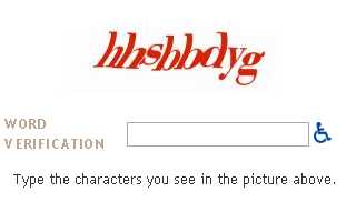
The reason it is exists is to stop spam bots posting comments on your blog. However it could be stopping regular human people from posting on your blog. You only need to turn word verification on when you’re being targeted by a spam bot - as in you’ll be getting a boatload of comments in a very short amount of time - and this will stop the spam bot from posting more comments. May I recommend you turn it off in the meantime?

Julie Pippert recently posted about Captcha and if you read her post you will see you might be missing out on comments if you’re using it. I have turned word verification off here for now, we’ll see how it goes..

The Bottom Line -

Spam is an issue for all of us. We get it in our email. We get spammed in our comments section. Unless you are being targeted in a major way and receiving hundreds of spam comments a day, it’s not that big a deal to hit delete. Have a good comments policy, make sure it is visible on the screen where people leave comments (blogger users - find out how to display your comments policy) and be vigilant in deleting anything you suspect of being spam.

Further Reading -

13 Reasons Why NoFollow Tags Suck I agree with the points, especially points 2, 3 and 5.

Ultimate List of DoFollow & Nofollow Plugins - Banish Nofollow From Comments and Trackbacks - Andy is the manager of the No No Follow community on Bumpzee. This post has a lot of fantastic info, worth a read.

Here’s Why You Should Add Dofollow To Your Blog Design David Airey expresses why he has chosen to become do follow and I can’t put it any better than he did in this article - especially this direct quote - “I want to give you every reward I can for your valued comments”.

Give a little link love say no to nofollow remove the link condoms Rob, I love the concept of link condoms! ;) This post contains some very interesting quotes from people at Google and Yahoo - worth reading.

I Follow Randa Clay created the Do Follow logos that you see around the place, here you can get them in different colors to suit your blog.

Bumpzee No Nofollow | I Follow | DoFollow Community - You can join the Bumpzee Do Follow community here if you are a do follow blogger.

I Reply, I Follow, I STALK!! Very interesting thoughts on both I Reply and I Follow.

Over To You -

If you liked this post, give it a stumble so other readers can find it. ;)

What are your thoughts on spam? Have you been spammed on your blog? Are you a Do Follow blog, and if not will you become one after reading this? Feel free to leave any comments - as long as they’re not spam!

Blogger Template Editing

Sephy’s post is now up, and if you are using blogger you probably want to bookmark this one for future use. ;) Great post Sephy! ;)

Demystifying Blogger Template Editing

Also, Sephy has posted on how to add a google search box to your blog. It’s simple and easy. Do it today!

How-to: Add a Google Search Box to your blog

Blog Design - Open Your Eyes.

Do you blog for you, or for your readers? This is a serious question that every blogger needs to consider carefully. If you blog for yourself, you will choose a blog design that appeals to you, not caring what your readers think. If you blog for your readers, you probably thought about what your readers would like to see when they visit your blog.

If you blog for your readers and you choose your design for you? You might be upsetting potential new readers without even thinking about it.

Some Food For Thought

Light Is The Norm

If I could design my blog to look how *I* want it to look, the background would be dark instead of light because I find dark backgrounds easier on my eyes. I design this site for the readers, which means light is the best choice. Not everyone has an LCD screen yet. Dark backgrounds on a CRT screen (the older style of monitor which is more like a TV) are difficult to view.

Dark text on a light background is what the majority of Internet users are used to. It is what they see on most websites they visit. They are so used to it that when you make a site with a dark background color, they react negatively without knowing why. If you want to appeal to the broadest range of people, you have to take things like this into consideration.

Everyone Sees It Differently

On a forum I visit - scambaits - they have a very dark color scheme but it used to be a lot darker. People reading the forum on the older CRT screens often had to highlight the text with their mouse in order to be able to read it.

Users had been doing this regularly for some time BUT NOBODY TOLD THE SITE OWNER they were having so much trouble with the color scheme until the owner was considering making a change to the site themselves. I cannot imagine how annoying it must have been for those people to read the forums.

The Psychology Of Color

When designing a site it is important to consider the psychology of color. When I was a part of the team putting together Fraudwatchers, we looked into what would be the best color for a website designed to support scam victims. Though I am no longer involved with the team at Fraudwatchers I still believe this is one of the best looking victim support websites on the net.

The three colors we considered using on the site were blue, lilac and green. These are calming colors. You’ll note these are colors I tend to use a lot here, too.

For more info on color psychology, check out Color_Expert.

Color Is Important

Another issue on the scambaits forums is color clash. Some colors do not work with the background color they have for posts. That means if a user chooses the wrong color to make their post with it can give readers a headache - and they tend to skip reading the post.

Red is one of the worst over there for color clash - and I had made a lot of posts using red with the old color scheme because it worked fine with that scheme, I had to go through and edit them all! We’re talking over 800 posts.

When you’re putting colors together on your site you need to stop and think - do they work together? Do they look good together? They may look ok on your screen but be sure to check how they look on other kinds of computer monitors too.

Take A Moment

I’m not the kind of person who keeps my mouth shut, so I would send a private message to posters whose colors clashed and let them know the colors were clashing on my screen. People were *always* appreciative of knowing how to make their posts easier to read. That’s because they want people to read their posts - just as you want people to read your blog.

If you visit a blog and something truly puts you off, you may want to consider letting the blogger know. Politely, of course. You may also want to ask your readers.. but..

Will People Tell You The Truth?

Ah, there’s the difficult part. If you have been blogging for a while, you have a little community of people who love your content. If you made your background red with pink text (take a look, I made it especially for ya’all), they’d still read it anyway.

If you ask your readers what they think of your site design, they will tell you what they THINK you want to hear. They will be loyal. They will be polite. They will be friendly. They are the equivalent of men telling their wives “No honey, I don’t think it makes you look fat”.

That’s all well and good - and wise on the part of the man and on the part of the bloggers who read you - by now you are probably reading them back and they do not want to risk your readership by being brutally honest.

Unfortunately it does not help you as a blogger who wants to improve your blog design. It does not help you capture new readers. It does not help you to know what they find annoying. Even if you ask them to be brutally honest, some readers will struggle to do so. Not me. ;) Just so you know. ;)

Brace Yourselves Now

I am about to tell you a harsh truth. New readers coming to your blog for the first time? They will hit the close button in that top corner without reading ONE word of your content if they are put off by the color scheme or your header graphic.

If your blog makes their eyes hurt. If it looks like fingernails on a blackboard for the eyes. If your header graphic is poor quality. If your font is unattractive. There’s a multitude of design mistakes you can make as a blogger which will send potential new readers away quicker than you can blink.

Whether You Like It Or Not

There are many blogs out there - and the majority of blog readers will take a blog with good design but lesser content over a blog with bad design and good content EVERY time.

You work hard on your content so you owe it to yourself as a blogger to present it to potential new readers in a way they can see it. Especially given how difficult it is to get people to visit your blog in the first place.

Ask Someone Impartial.

If you want a fresh set of eyes to take a look at your blog the way a new reader would look at it, RT Cunningham from The Untwisted Vortex will review your blog if you leave him a comment. For free! He will tell you the truth. He won’t be nasty about it. He’ll just be honest. It might be hard to hear but you may need to hear it. He also will give you ideas for improvement, which is useful.

Hari from Hari’s Corner who also guest blogs at The Untwisted Vortex is doing blog reviews for free there as well. I have found some great new blogs by reading their reviews - and that’s one side benefit of being reviewed, there are people reading this right now who found me via that review RT did. Hi ya’all, welcome! ;)

Resolution Matters

If you are viewing my blog with your screen resolution set to 800×600, you have a vertical scroll bar at the bottom of your screen. My template width is 1000. That means there’s 200 extra pixels you have to scroll to see. In fact that is my entire right sidebar. Not a good look, right?

When I designed the template, I knew about this. I looked at my site stats and saw the majority of my readers (90%) were viewing the site in 1024×768 - which is becoming the new standard these days. It used to be 800×600 but as people change to LCD screens and larger screens they can’t use 800×600*. Unless they are my parents, in which case they will use 800×600 for everything because it makes the text bigger - they are too lazy to wear their glasses!

Make A Decision

So the first thing you need to do when considering a blog re-design is make a decision about resolution - and you need to take into account what your readers screen resolution is in order to do it. This means looking at your counter - bearing in mind counters are unreliable. 800×600 is one way you can go, 1024×768 gives you a lot more space.

If less than 85% of your readers use 800×600, you could go with 1024×768 but know that you run the risk of annoying people who use 800×600. On my site, they’ll miss out on seeing the right sidebar but they get the full main text and the left sidebar. That’s an OK compromise.

I found these excellent articles which are worth a read before you make the decision - How Tall and Wide Should I Design My Website? and also Understanding Monitor Resolution

Don’t Change

There is a blog I removed from both my reader and my links. The reason I removed it is simple. Each time I went to the blog, they were using a new template. They had changed it many, many times over the last couple of months. I feel like they are never going to make up their mind and stick with one template and frankly, I’m tired of watching the indecision in progress!

If you want to try out a new template don’t do it on your actual blog that readers visit. Test it out on a test blog first. Blogger makes this easy for you - you can have as many blogs as you want. Just be sure to remember **this blogging tip. When you are sure you’re happy with it, install it on your actual blog - and stick with that template for at least 2-6 months.

Change is Hard

People do not like change. We bloggers are constantly tweaking, moving things around, adding things, removing things, making new blocks in our sidebars. I am as guilty of this as the next blogger. I am not saying never change anything, I am saying keep in mind the impact it has on your readers.

Your readers may know where to find something right now. If you move it and they are looking for it, they will be frustrated unless they can easily see where you moved it to. If you feel the need for change (as I recently did with my sidebars) pick one day, post a note to your readers who may turn up mid-changes to “bear with me, I’m changing some things around”, mess with it till you have it as you like it, then let your regular readers know what you have changed or removed via a blog post.

Above The Fold.

The instant first impression a user has of your website is what loads onto their page that they can see without scrolling. This is called “above the fold” - you know those broadsheet newspapers which have a fold on the front page, about halfway down? They know what is above the fold is what people see - and why they buy the newspaper.

It is no different on your blog. Decide what you want people to know about you when they first look at your page, and put that above the fold.

Browser Matters

Most people only use one internet browser. It might be Internet Explorer. It might be Mozilla Firefox. These are the two main ones you will see on your site stats. Do you know how your site looks in the one you don’t use? Do you know how it looks in different versions of the one you don’t use? A lot of people don’t use the latest version of browsers - when they find a stable one they stick with it like super glue.

Do you know how it looks in the rarer browsers like Opera, etc? Make a blog post where you ask people using those browsers to take a screen shot for you. Your readers using those browsers will generally be happy to help out.

IE NetRenderer allows you to check how a website is “rendered” (how it looks) when using Internet Explorer - several versions of it. I am still looking for a version of this for Firefox. Anyone know where to find it?

Flashing is bad

People associate flashing things with advertisements, which are becoming more prevalent on all the websites we visit these days. For Firefox users, you can get an extension called Ad Block Plus - and let your inner self be at peace without ads interrupting your internet. For your personal blog, I do not recommend anything be flashing. It’s annoying to many people.

Template Blend

Blogger has a standard set of templates which people can use. It is easy to just pick one of those and leave it at that. You would be making a major mistake as a blogger if you did, though. Anyone else using that same template can be mistaken for you. It is sort of like walking into a room where everyone is wearing the same outfit. How do you find the people you know, among the apparent clones?

The least you should do is change some of the colors and the font - Sephy’s post will explain how to do that. You can check it out here - Demystifying Blogger Template Editing.

Good Templates Are Out There

I saw some lovely blogger templates the other day.. check these out.. which are very much more grown up than the blogger basic ones.. They look more like WordPress templates than Blogger ones.

Pannasmontata Templates

Some of my faves from the Pannasmontata collection are -

number 23 - Maschere; number 29 - Lands (3 column); number 31 - Placide; number 33 - Onde; number 40 - Delfini; number 41 - Words At Sea (3 column); number 42 - Bonsai; number 57 - Abstract Thoughts (3 column); number 58 - Abstract Mind (3 column); number 71 - Frost; number 77 - Piercing; number 78 - Locked; number 83 - Cherrylicious; number 87 - Attention Please; number 93 - Tux Who?

Not Everyone Agrees.

Good design is not easy. There is no one size fits all. If there were, nobody would want it because all our blogs would look the same. As a blogger, what you need to do is make sure you are not turning off new readers by making bad design decisions. Unless you’re writing your blog just for your friends and family, who will love you regardless.

New readers won’t have a chance to love you. They’ll be leaving skid marks with their mouse in order to close your site as quickly as they can, and move on to another blog - where the content may not be half as good BUT they aren’t offended by the design, or the flashing ads, or the music that starts playing without them asking for it, or the myriad of other things you can get wrong as a blogger.

Further Reading -

15 Design Decisions That Annoy Readers - Some seriously annoying things that bloggers do are listed here - do YOU do any of them? ;) I do - I need to look into that Google Ajax search box, adding it to my todo list for tomorrow.
45 Excellent Blog Designs - Inspirational stuff!
Things to Avoid: What Makes Me Nervous When Reading Your Blog - Blogger does not give our readers the chance to subscribe to comments, which is why I use co.mments myself. I don’t like to lose track of conversations I took part in.
Blog Design at ProBlogger - This is the category for Blog Design which contains quite a few useful food for thought posts.
Top 10 Weblog Design Mistakes - I disagree with number 2 - sometimes I think putting a photo of yourself on your blog is a terrible idea and some of the ones I have seen scare me greatly. Number 5 I think a lot of bloggers miss out on. Your top 5-10 posts should be shown above the fold - give readers the chance to access your best posts as soon as they land on your blog. You’ll note I have moved mine to be above the fold now.

Useful Things -

VisiBone Webmaster’s Color Lab - You can test colors against each other here.
Non-Dithering Colors - Gives an explanation of why the 216 color palette is better for use generally, and also all the color codes you may need.
HTML Goodies - Lots of HTML goodness to help any blogger.

Over to you

What are your thoughts on blog designs? Do you like yours? If not, do you want to change it? Do you need help to change it? Sephy is writing a companion post to this one which can help you with a few things.

If you liked this blog post, feel free to Stumble it. :)

*Unless they are my parents, in which case they will use 800×600 for everything because it makes the text bigger - they are too lazy to wear their glasses! This drives both me and the other half absolutely up the wall. They have a wide screen laptop. I’ll take a photo of what a webpage looks on it for ya’all sometime, but in the meantime it looks bad. Trust me. ;) It’s truly fingernails on a blackboard for your eyes.

**Cybercelt left me a great comment about that a while back, letting me know that you can go into your Blogger profile (on your profile page when you are signed in, click edit my profile, then Show my blogs, then Select blogs to display) and choose which blogs are displayed in your profile. If you have more than one, I suggest you choose one to be the main blog, and link to your other blogs from that blog page rather than have them all listed in your profile to make it easier for people to find you, but it’s your profile. ;)